THE PENN CENTRAL LOGO:
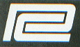
If you look at the logo close, you will see a separate letter "C" inside a letter "P", standing for both "Penn" and "Central", for those who actually had no idea about this (at 1st glance, some may see it as some version of the number 2-the logo actually can have that double appearance as well). The font styles of these letters are similar to the PENN CENTRAL spelled-out road name used on equipment, etc., known as Square Bold Extended italic font (there are other names for this font style as well, but this is the style of font that was used), except the "P" and "C" are elongated, with the proper cut-outs for the letters to fit inside each other.
The PC had a few ideas before settling with the name PENN CENTRAL. They thought of PENNSYLVANIA CENTRAL, PENNSYLVANIA NEW YORK CENTRAL, CENTRAL PENN, etc.
Generally, the logo was white, applied over black, green, blue, yellow backgrounds.
Variations of the logo appeared on freight cars, cabooses, locomotives, building signs, and other small equipment-if not more. 1 variation was only with the letter "C" of the logo being orange (not red!-although they probably had this as well, although not common, as the PC had all kinds of variations), with the white "P". Some say the orange "C" was to highlight the NYC part of the PC, but being the NYC was usually known for its green colors, they should have had the "C" green (again maybe they did in not-as-common applications).
Another variation was the "P" in the logo being the color red, with the white "C". The red "P" some say highlighted the PRR part of the PC, being the PRR's main colors were red.
Also, the PC logo had other variations in color. It came in all teal-green, over white (or off-white), as used on sticker-signs placed on PC work-related vehicles; all black logo applied over green, unpainted stainless steel or aluminum, etc.-such as on MU's; yellow logo applied over green or red-such as on passenger cars, etc.
The PC logo was applied as the logo alone, or with the PENN CENTRAL roadname spelled out directly below the logo. Both ways were applied on just about any equipment/buildings you can think of.
The logo also came in many sizes as well. The smallest logo (not counting the PC logos used on paperwork) probably were applied to small M of W equipment or signs used on PC property, and the largest logo applied to their very large 86' high-cube box cars and GG-1 locomotives. (More exact measurement information about the sizes of the PC logo to follow later..)
How did those logos, roadnames, and numbers always look so clean-cut (edges not hazy, no over-spray, or "chalk-runs"), and seem to never fade on equipment? This is mostly true with most locomotives, piggy-back truck trailers, some M of W equipment, property signs, (cabooses?), and passenger cars that received logos/roadnames/numbers, which were made from vinyl, and NOT painted on. They were usually die-cut (who made them?--might be the 3M company), and were applied by spraying a wetting solution-or water, the paper back was removed, and slid into place- similar to model decals, only much larger. Freight cars mainly had the logos/roadnames/numbers/etc. painted on using stencils however. If you have ever seen pics of locomotives with broken-up-looking logos, etc., usually it was because someone tried removing the decals, or painted over them, etc. Being white, they usually didn't fade. They did over time show signs of age by cracking or unpeeling in areas, seen more so up close.
Other details, for those detailed-oriented people....over the PC years, the actual spacings between the "P" and "C" in the PC slanted logo had changed. Some spacings were wider or narrower than other logos. Also the length and size of the logo had different variations (the longer, shorter locomotive nose logos- used on some EMD FA & EA units; the shorter and taller nose logos used on other units; the more square elongated nose logos used on some GE & ALCO units, etc.; also the road name letters varied somewhat-as in the width/length of the inside areas of the R's and P's, and C's of the roadname as well.) Either it was how the logo/roadname was applied (vinyl scotchbrite sticker logos), or inaccuracies in how the stencils were cut, or just different versions in PC stencils & vinyl die-cut logos. Throughout the system variations on almost everything was very common (as we know by paint schemes alone!).
Click For Further Details About the PC
Back To PC Short Overview Page
(Or please use your Back button on your browser to go back)
©2001-2009pcrrusa